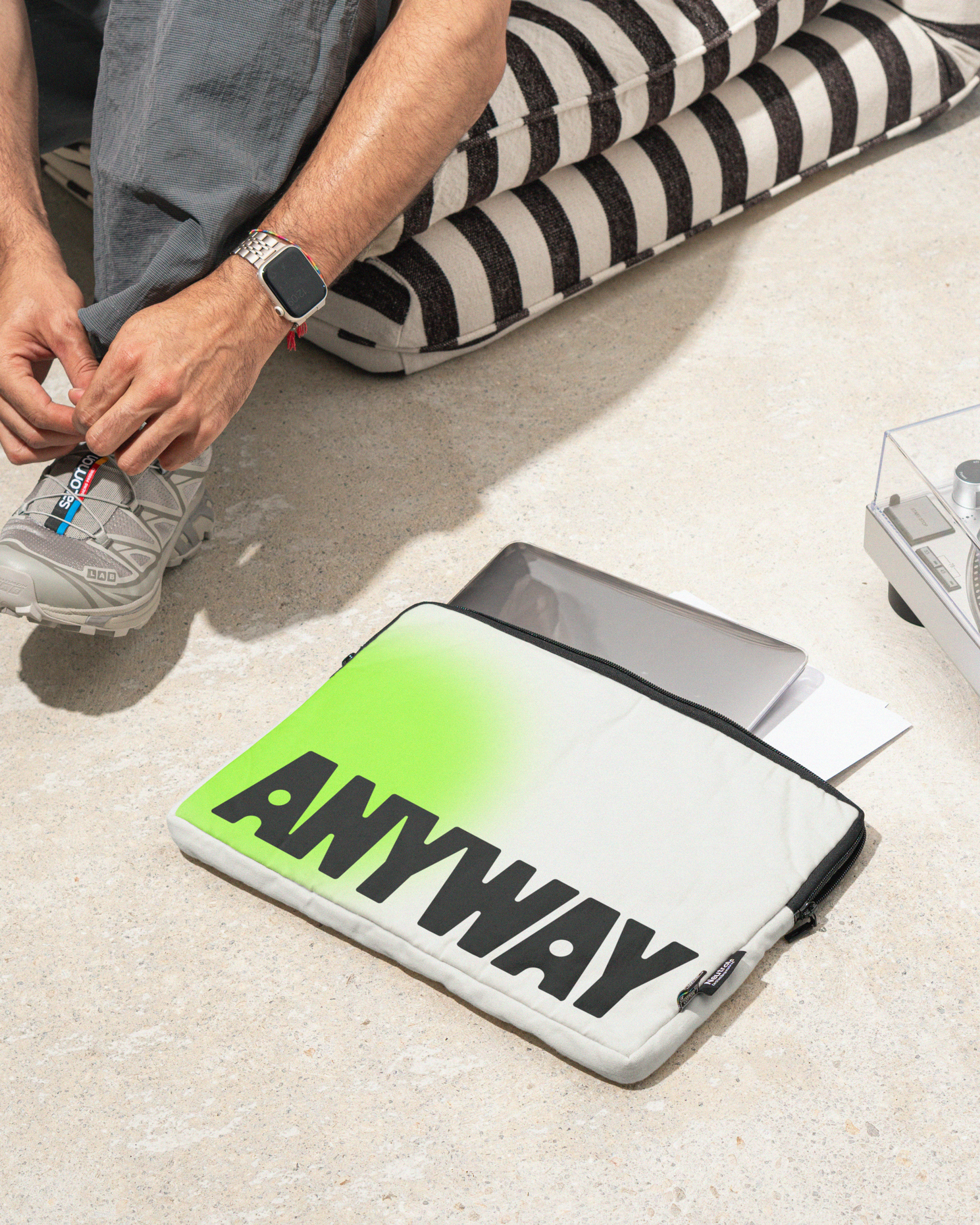
Anyway Shining a spotlight on your future.
Originally called Year13, the business helped students explore life beyond school, but its brand spoke more to career advisers than to students themselves.
We reimagined it as Anyway: a name that captures possibility without pressure. A brand that balances the excitement of what is ahead with the reassurance of guidance.
At the heart of the identity is a spotlight. A glowing symbol of discovery and direction. It moves with students as they navigate what comes next. A vibrant green brings it to life, energetic, optimistic and human. Every element, from motion to interaction, expresses progress and clarity through an otherwise uncertain time.
The logo nods to the brand’s editorial origins. Designed as a confident masthead, its flowing connections echo the twists and turns of growing up.
A versatile illustration system reflects the variety of paths students take: expressive, diverse and made to be created quickly. The typography is simple and assured: black only, sharply hierarchical and designed for clarity across fast-moving social content. Photography grounds the brand in real life with candid, film-like moments that capture the beauty and uncertainty of finding your way.
The result is a bold, human brand that replaces pressure with possibility, giving young people the confidence to step forward and figure it out, anyway.
Services
Strategy
Identity
Design
Digital
Motion
Otherway just got us. They understood the heart of what we’d built and helped us transform it into something bigger and braver, without losing where it all began."
Selected work