IG Designing a platform to champion investors.
IG has long been one of the most recognised names in trading. But as investing became more accessible, more digital and more self-directed, expertise alone was no longer enough. The brand needed to do more than explain the market. It needed to stand alongside the people navigating it.
Working with our sister agency 21st Century Brand, IG was repositioned as The Investor’s Champion. A platform built to challenge anything that gets in the way of progress, from within the industry itself. Otherway brought this ambition to life through a new identity, tone of voice and digital experience that makes IG clearer, warmer and more human, without losing authority.
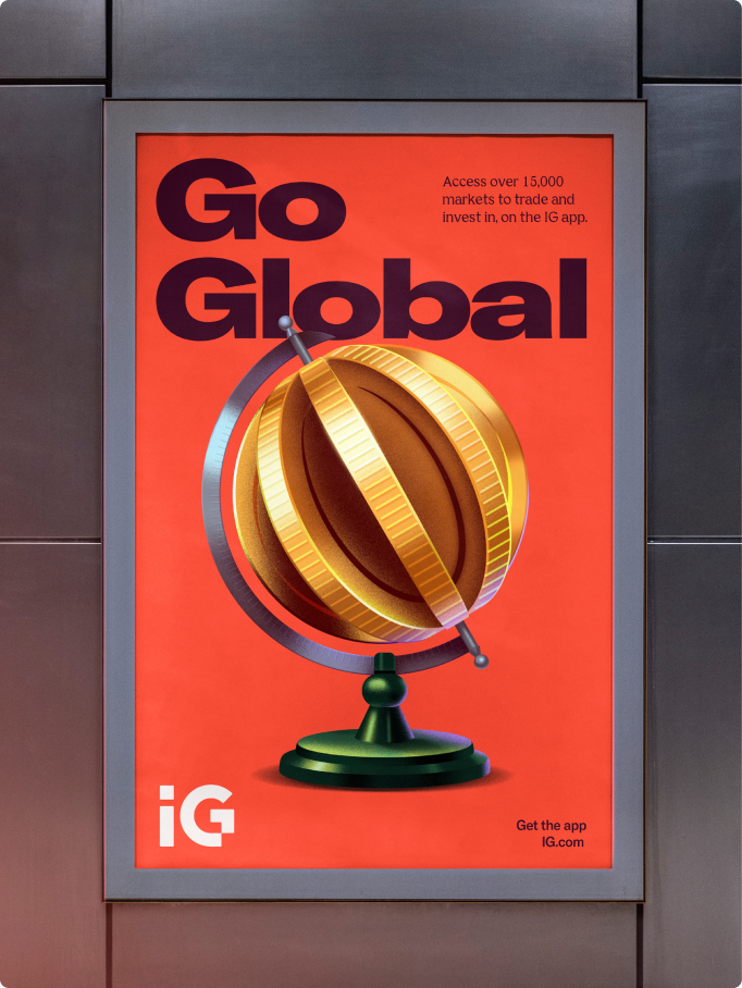
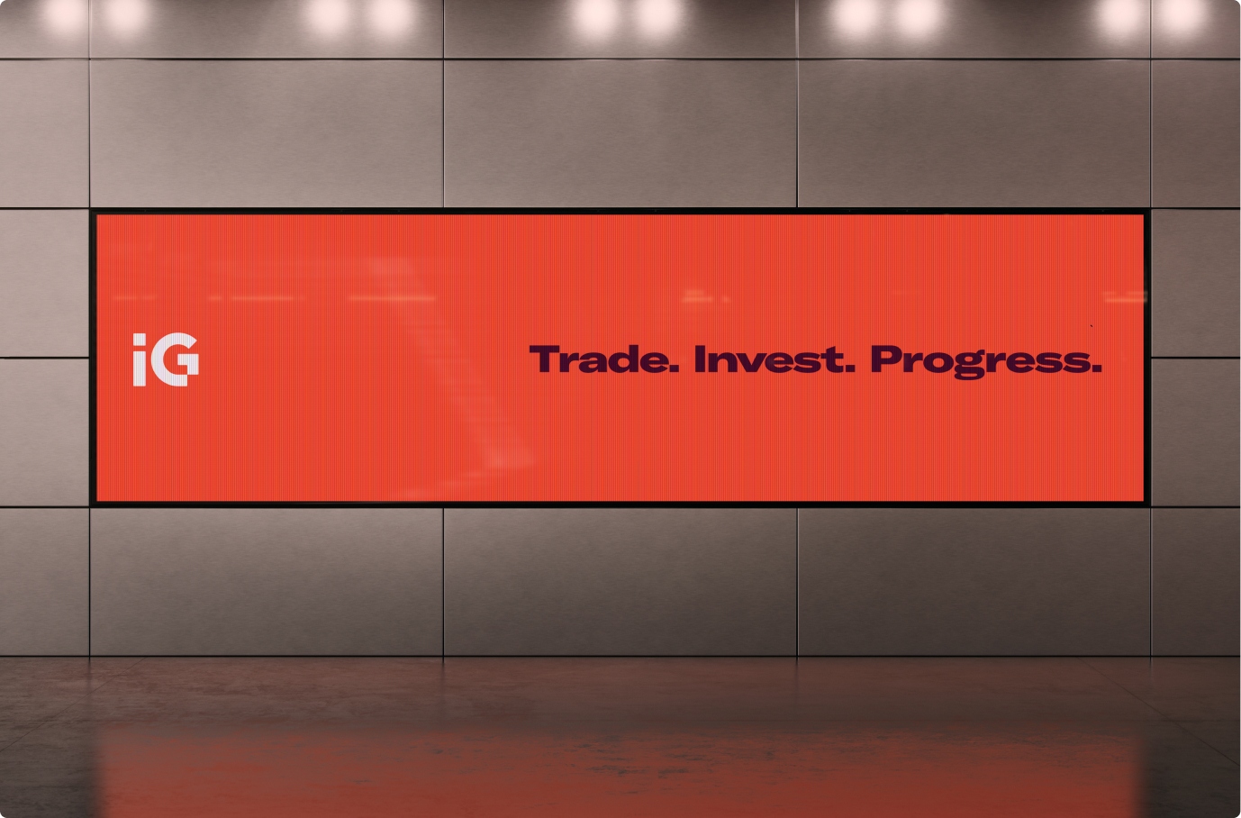
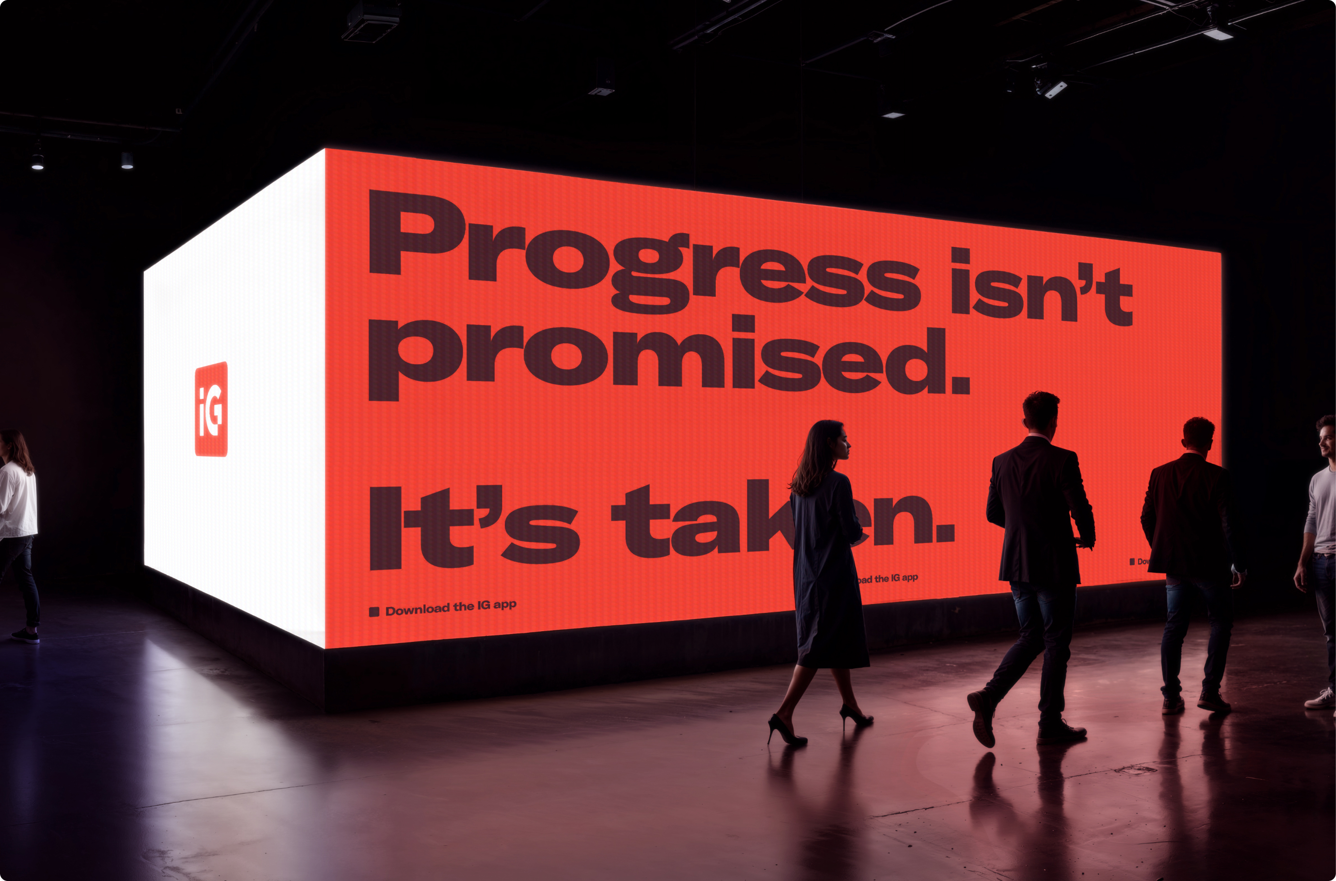
Progress became the organising idea for the work. IG’s two-letter name, once a constraint, became an opportunity. A bespoke wordmark introduces a subtle arrow to signal forward movement, while softly rounded details improve legibility and approachability. The existing red square was evolved to add meaning, transformed into a dimensional cube that can flex across the system. It becomes a simple, ownable way to express the breadth of what the platform offers, anchored by the idea of “Trade. Invest. Progress.”
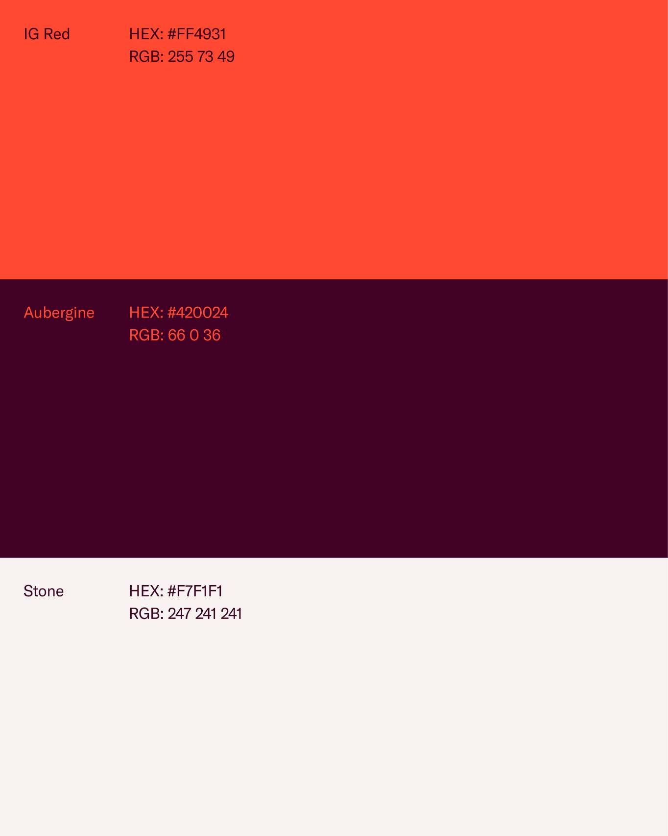
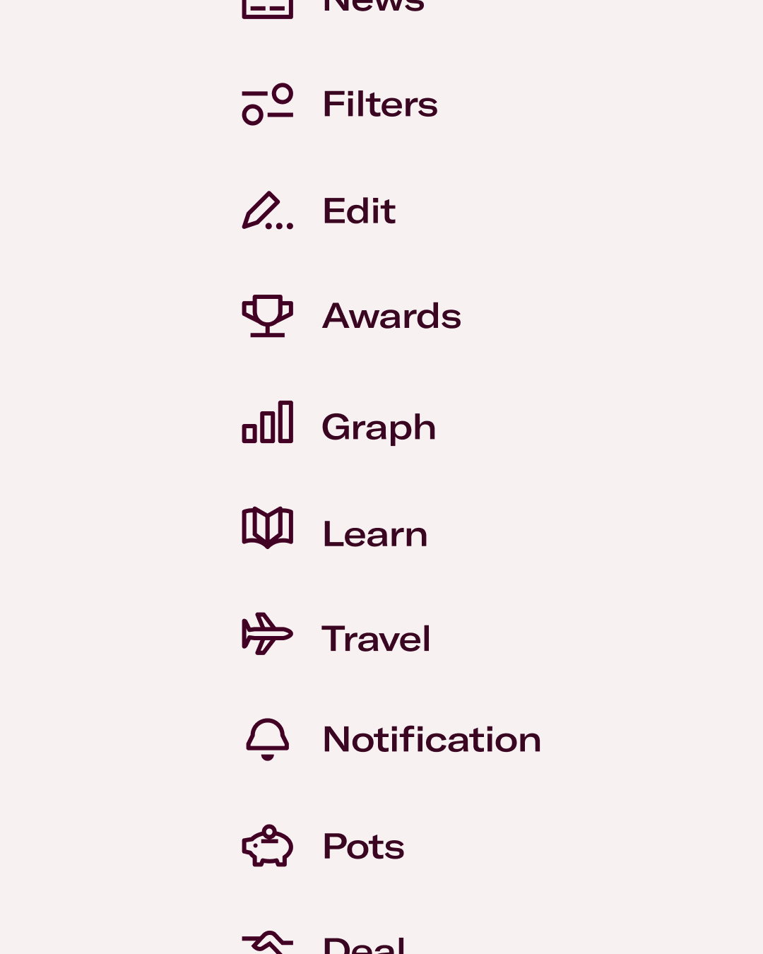
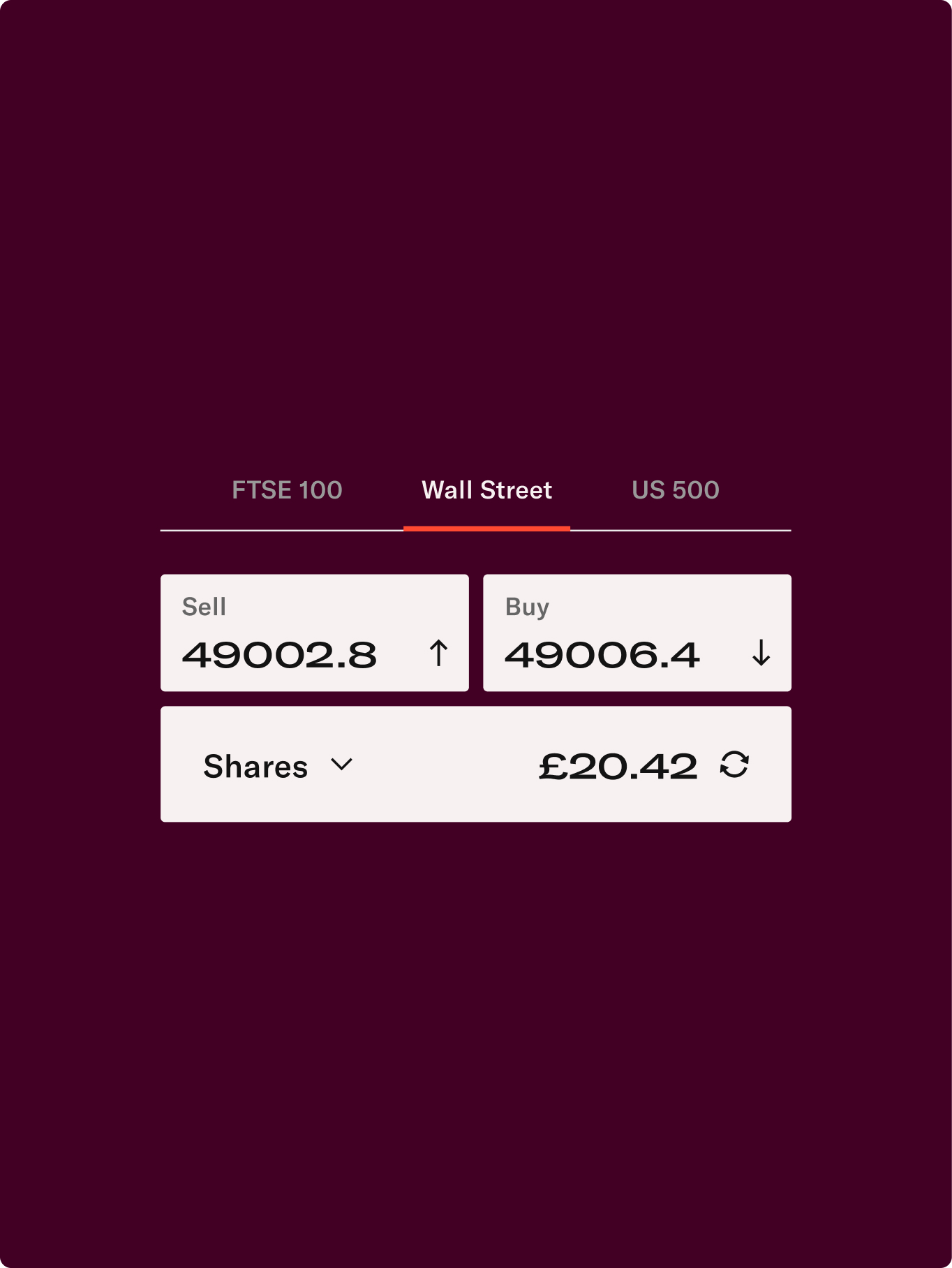
The colour palette was refined to balance confidence with warmth. IG’s red was softened, paired with a deep purple for authority and a stone tone to bring contrast. Typography plays a similar role. GT America delivers clarity and pace, while Bianco adds structure and editorial weight, helping complex information feel easier to navigate.
Across the wider system, the design takes cues from editorial layouts. Clear hierarchy, open spacing and considered rhythm replace clutter with clarity. Motion and three-dimensional elements reinforce a sense of forward movement, while the cube reveals tools, insights and outcomes, reflecting how IG supports investors at different stages of their journey.
To further develop the brand, Otherway collaborated with illustrator Ana Miminoshvilli. Drawing on the language of editorial illustration, her work brings warmth and wit to complex subject matter, creating visuals that feel approachable and informed. The illustrations work seamlessly across product, marketing and large-scale brand communications.
The tone of voice completes the shift. Confident but never condescending, it reflects a brand that is firmly in the investor’s corner, offering encouragement, challenge and guidance in equal measure. Short, direct sentences create pace and momentum, helping turn hesitation into action and reinforcing IG’s role as a champion for modern investors.
Services
Identity
Voice
Design
Digital
Motion
Credits
Illustration: Ana Miminoshvilli
Selected work