The Whisky Exchange Changing the spirit of the category.
The Whisky Exchange has always been a place for discovery. A world of rare finds, remarkable makers and spirits worth knowing. But in a category steeped in tradition, there was an opportunity to do things differently. To create an identity that not only reimagines the brand, but brings a fresh perspective to the world of fine spirits.
The strategic challenge was to find the balance between expertise and accessibility. Too much emphasis on the intricacies of the category risked alienating new audiences; too little would dilute what makes The Whisky Exchange special. The answer was to embrace its obsession with spirits and turn its depth of knowledge into an invitation. Opening up a world of discovery and inspiring a deeper appreciation of the world's spirits.
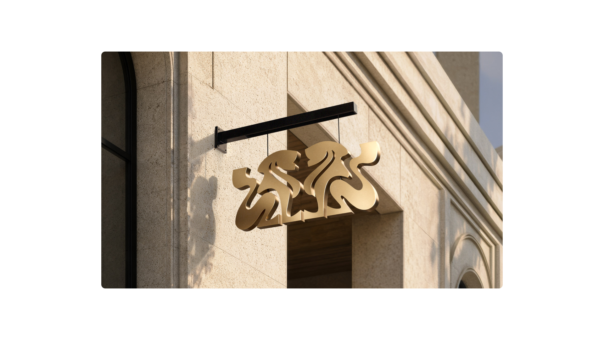
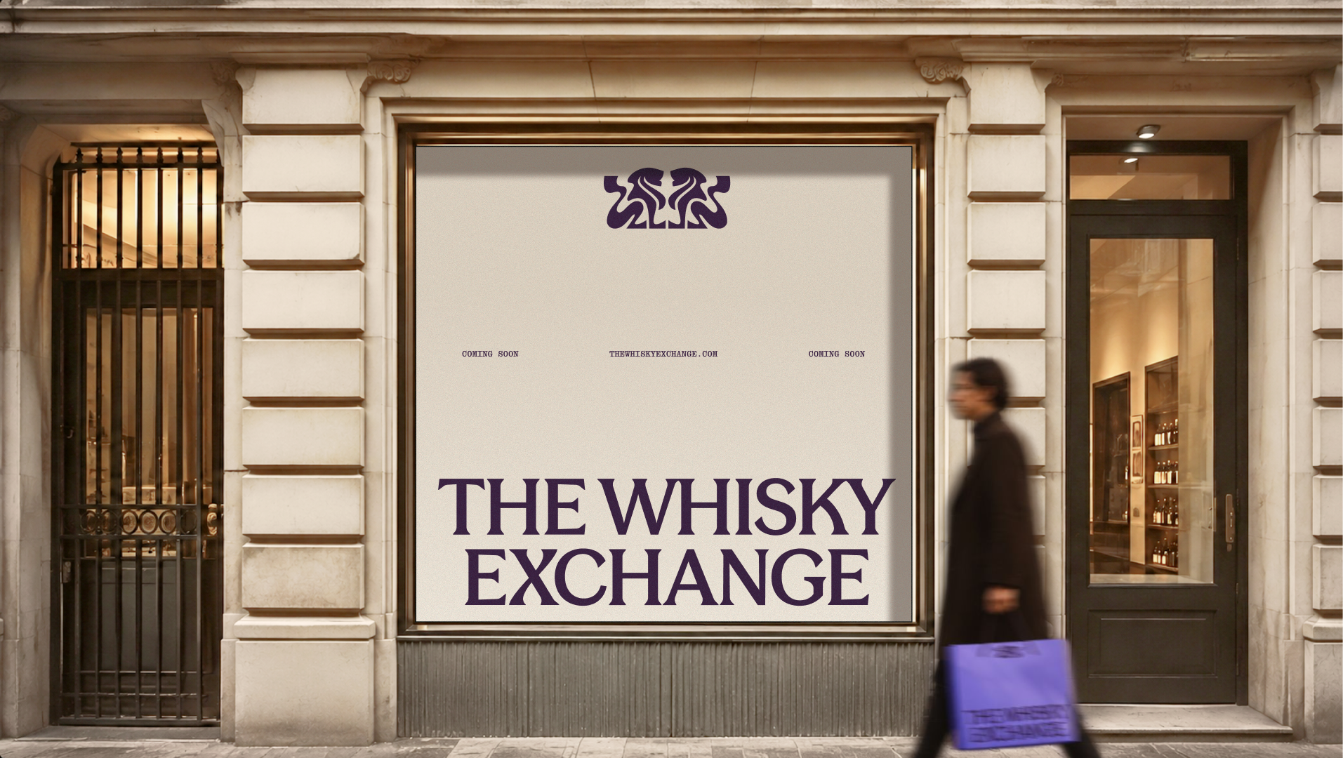
At the heart of the rebrand was a new take on their original crest. The lions remain, reworked with a lighter, more fluid expression. A familiar symbol given a new sense of life, balancing the authority of heritage with a more contemporary elegance.
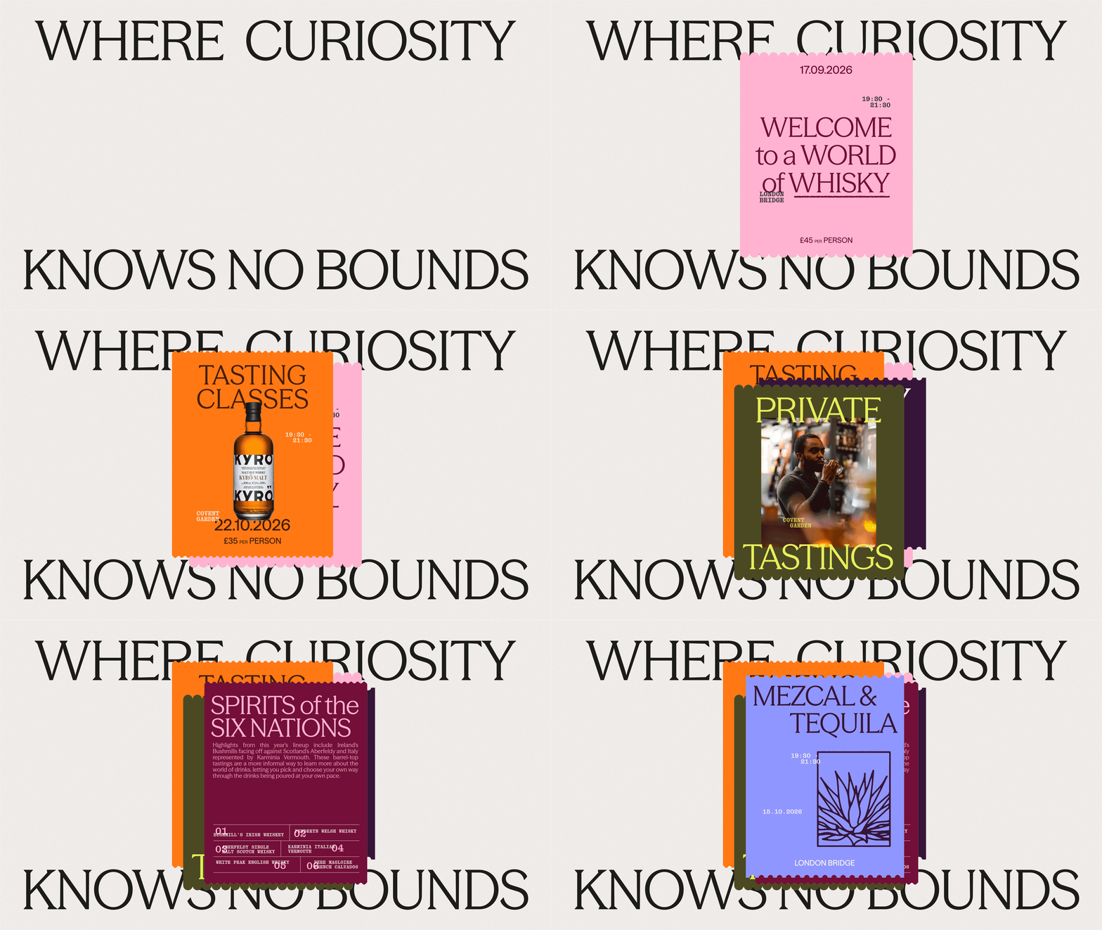
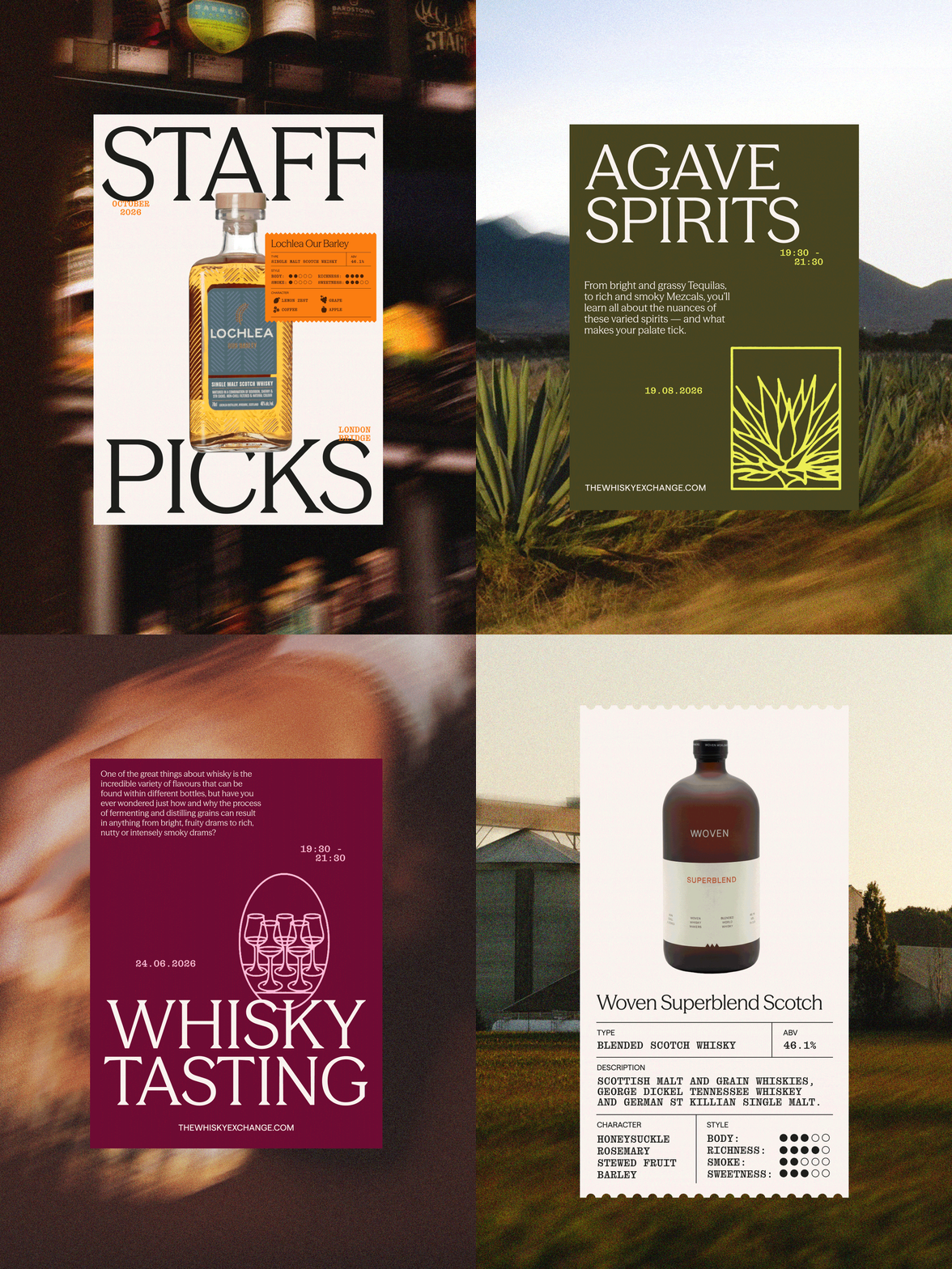
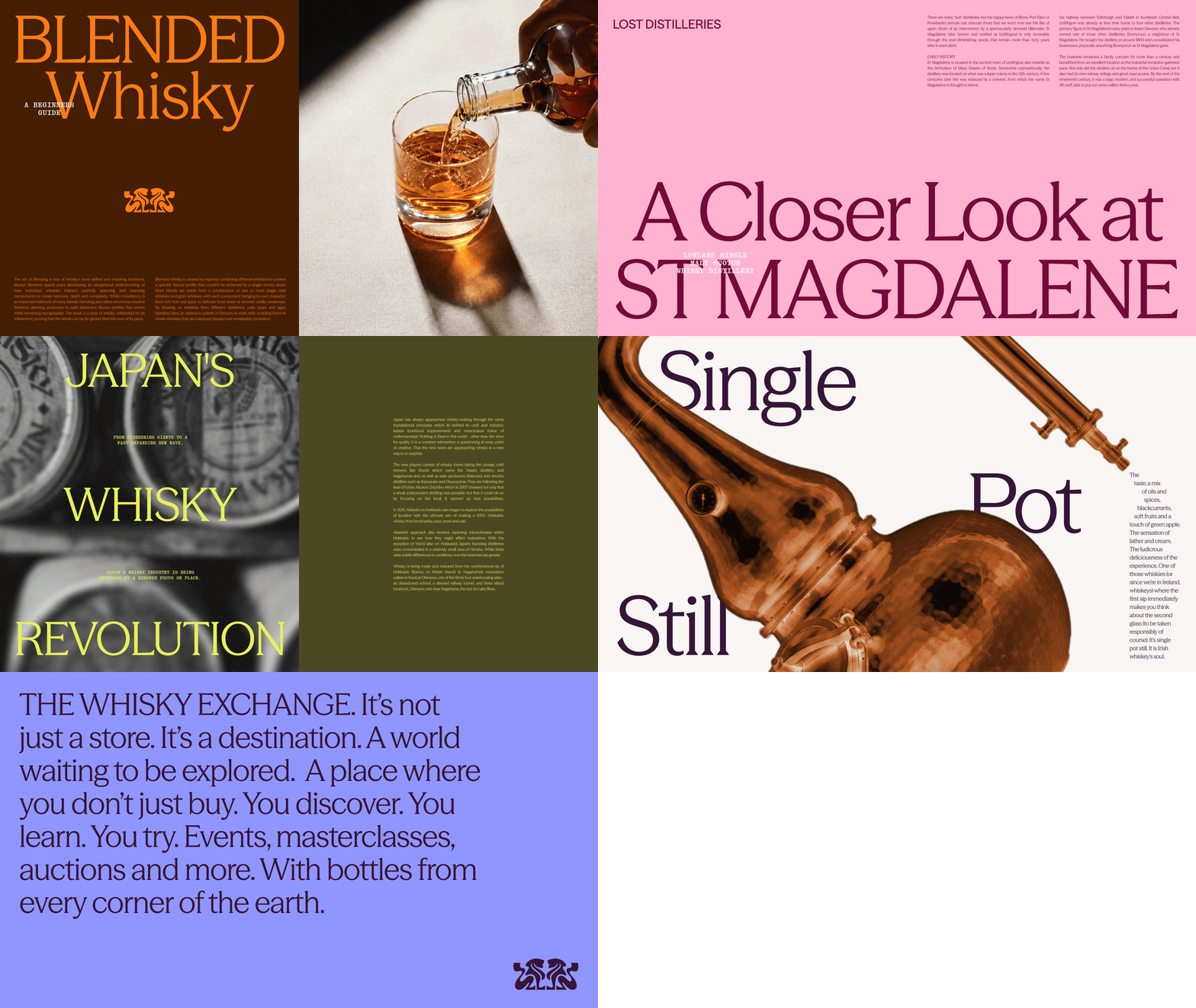
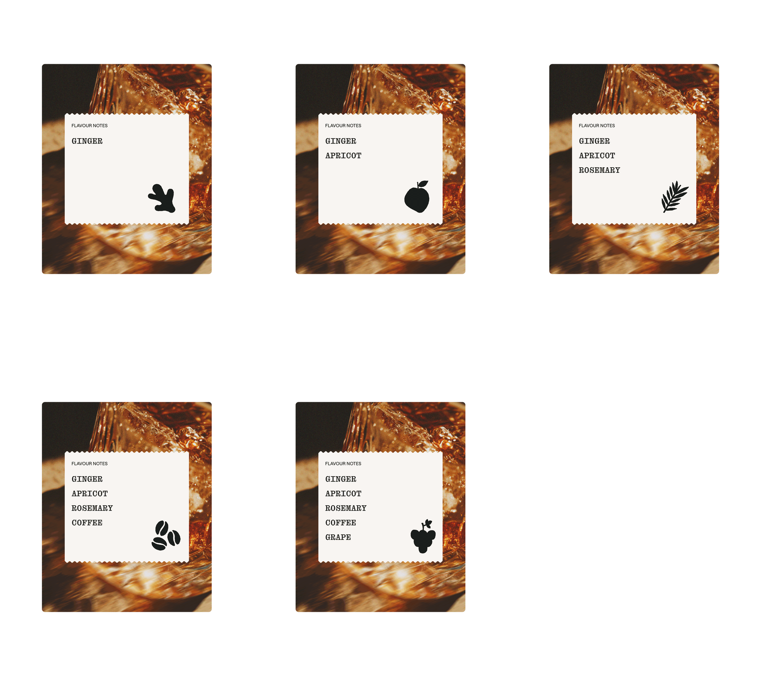
The wider identity builds a similarly fresh approach. Held together with a vibrant purple, giving a classic luxury palette a new energy. The visual world isinspired by the layers, textures and stories found across fine spirits. Stamps, graphic shapes and overlays draw on the character of printed labels, bringing a tactile quality and sense of expression to the design.
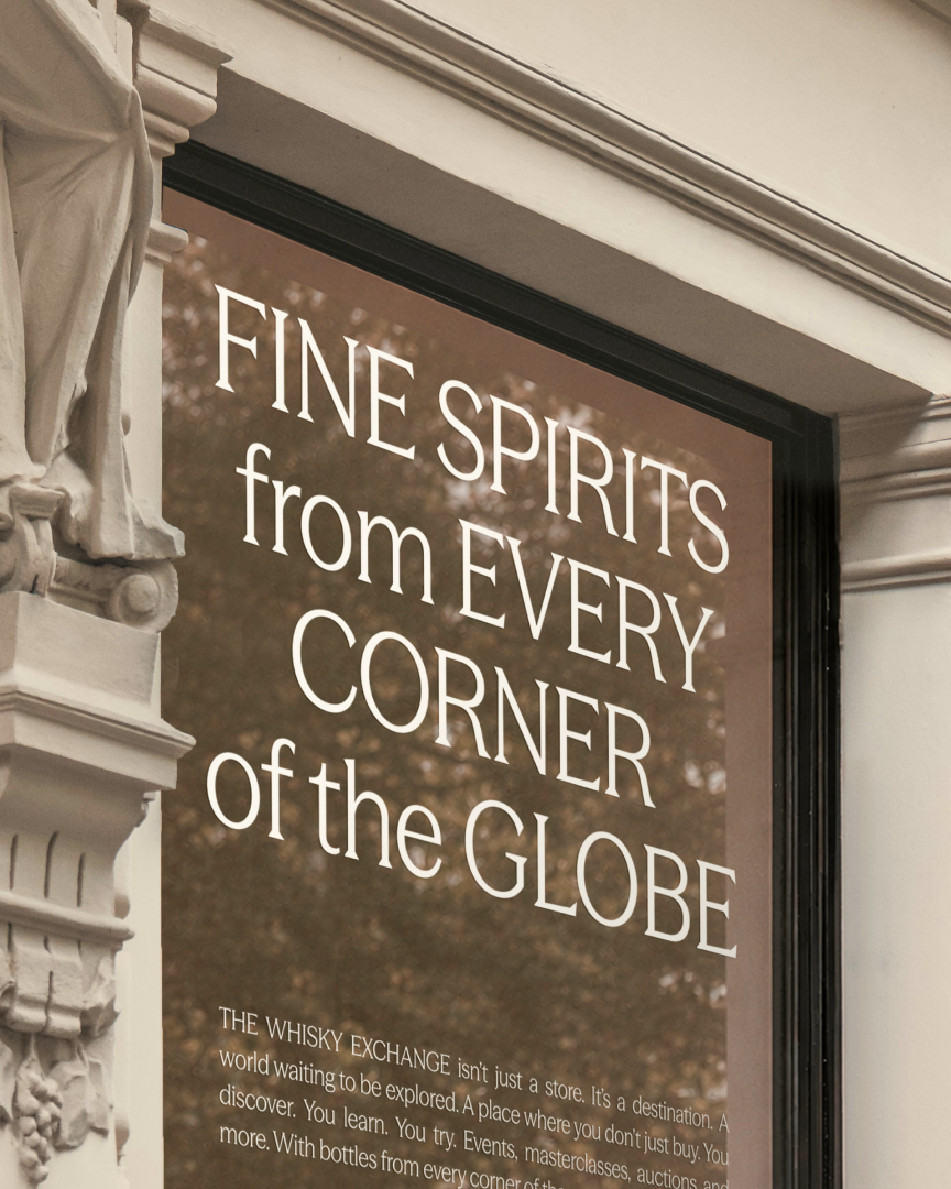
From bags to store, the identity carries through with a distinctive new presence. Every detail considered, creating an experience as rich and varied as the spirits themselves.
Services
Strategy
Identity
Voice
Design
Digital

Selected work